From Inconsistency to Clarity: Building a Design System for Steam
This project taught me that creating a design system is a cultural shift — not just a visual one.


A semester-long collaboration to create a design system that’s scalable, consistent, and built for real-world use.
Gears is a scalable UI design system created for the Steam platform to reduce visual inconsistency, design friction, and production time. Built through a deep audit of real product screens, the system standardized colors, typography, and core components, supported by clear documentation in Zeroheight. Gears demonstrated measurable impact by reducing page build time from hours to minutes while reinforcing consistency, accessibility, and long-term scalability.

Introduction
- Project: Gears — a UI Design Kit for the Steam platform
- My Role: UX Designer
- Duration: 4 months
- Tools: Figma, Figjam, Zeroheight
“This project taught me that creating a design system is a cultural shift — not just a visual one.”
Overview
Steam is one of the most widely used gaming platforms in the world. Despite all the years it’s been in the industry, it has never had the presence or intent to organize its interface into a design system. Over the years, its interface has grown cluttered, inconsistent, and difficult to scale with all the variations across its screens. Designers are rebuilding similar components repeatedly, making small visual decisions from scratch, and unintentionally introducing inconsistencies across screens.
Gears was created to solve this by providing a centralized, accessible, and production-ready design system that enables faster workflows, stronger visual cohesion, and fewer errors across teams.
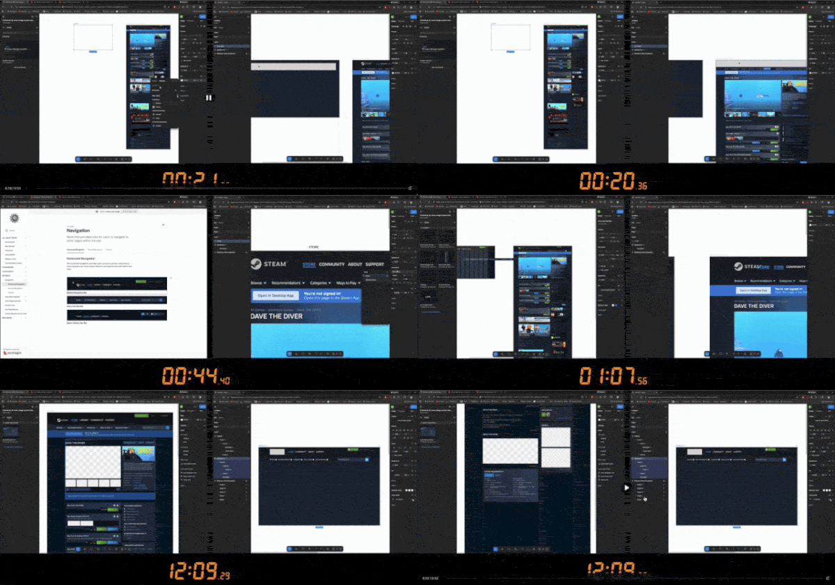
In this video, we compared Designer A, who is using our design kit, with Designer B, who is doing it the good old-fashioned way.
At this pace, Designer B is projected to need 4 hours to finish what Designer A has created in just 12 minutes.
The Problem
Designing new pages and features for Steam took too long and felt unnecessarily repetitive.
Designers were frequently recreating the same components from scratch, guessing spacing, typography, and color usage, introducing small inconsistencies across screens, and overall spending more time aligning visuals than solving user problems.
When deconstructing just two screens from Steam, we found:
- 30+ color variations
- 55+ typography styles
- 50+ button variations
Too many buttons, typography, and color options in one platform create an environment of inconsistencies that delay the design process.
So, we started to deconstruct.
Research & Audit
We began by deconstructing Steam’s most high-traffic and critical screens. This included:
- Store pages
- Game detail views
- Navigation elements
- Buttons, modals, and form components
We captured screenshots from each section we set out to redesign, compared variations, and identified where inconsistencies appeared most often. This step was the most crucial foundation for Gears.
While we kept the scope fairly small by redesigning only the store and library pages, we found 51 types of buttons, 54 typography styles, and 33 colors across just these two screens. This proved the number of inconsistencies we needed to address.
Our Solutions
To reduce the number of similar components, we identified the most popular ones and blended them into recyclable components that can be shared across all pages of Steam.
For example, we started with the colors:
1. Colors

After finding over 30 color variations on Steam’s Store & Library, we quickly saw how the majority of the colors existing on Steam varied ever so slightly throughout the pages, and we found out that most of them even violated WCAG standards for visual accessibility, so it was ideal for us to redesign and adjust them to match and transform these color combinations into accessible ones to make Gears WCAG approved.
We kept the same mentality when it was time to redesign the components and patterns that shaped over 80% of Steam’s content.
2. Typography
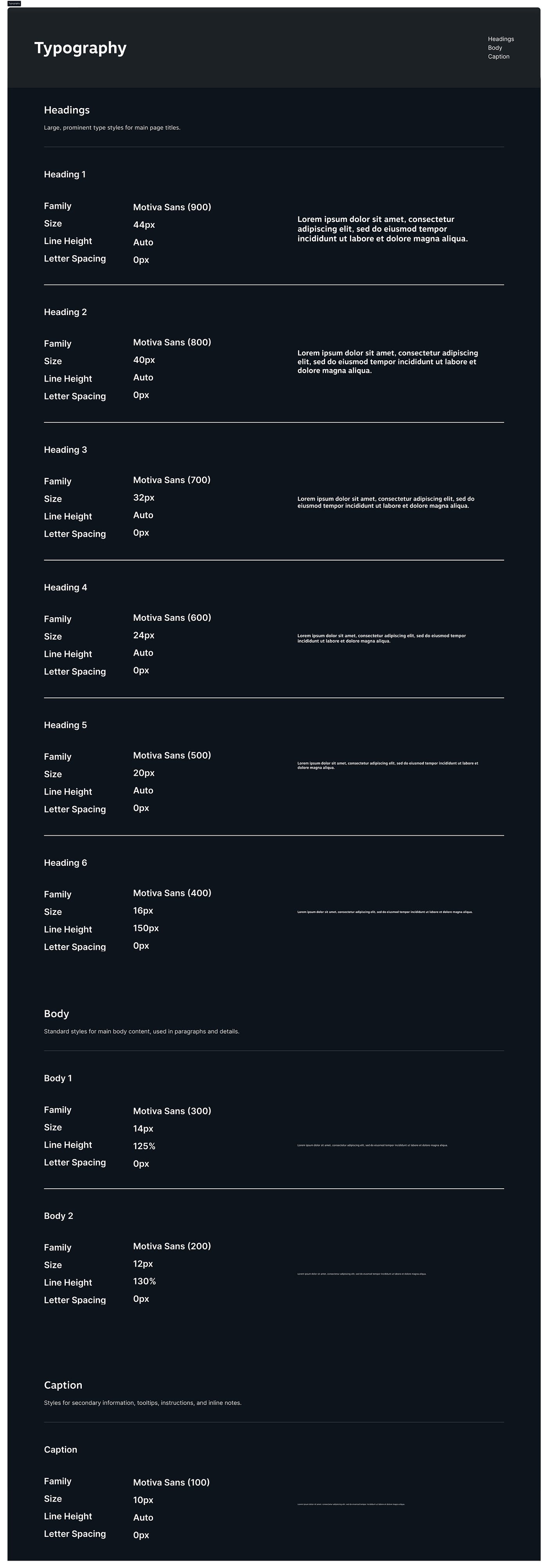
After auditing Steam’s interface, we found over 50 typography styles being used across just two screens. Headings, body text, and labels often varied slightly in size, weight, or spacing, even when serving the same purpose.
To solve this, we defined a clear typographic hierarchy that established consistent roles for each text style. Instead of designing text case by case, designers could now rely on a standardized scale for headings, subheadings, body text, captions, and UI labels.
This system reduced decision fatigue, improved readability, and ensured visual consistency across all pages while still allowing flexibility for different content types.
3. Buttons
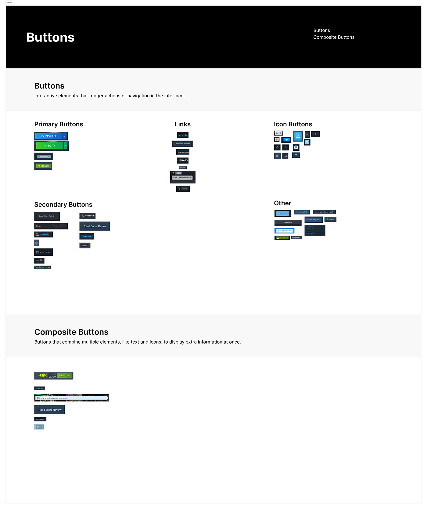
Buttons were one of the most inconsistent components across Steam. During our audit, we identified over 50 button variations that differed in color, size, and interaction states, often used for the same purposes, yet they were different.
This makes it difficult for designers to know which button to use and when, leading to inconsistent interactions and unnecessary redesign work.
To solve this, we consolidated button styles into a small set of reusable components with clearly defined roles, states, and variants. Primary, secondary, and tertiary buttons were established to clarify hierarchy, while consistent sizing and interaction states ensured predictable behavior across the platform.
By standardizing buttons, designers could move faster, make fewer decisions, and maintain consistency across screens without sacrificing flexibility.

By standardizing these three major concerns, layouts became easier to build, easier to scan, and easier to scale as new components were added.
Documentation
Presenting Gears: The ultimate design kit

Gears is guided by five core principles
- Consistency with flexibility
- User-centered interactions
- Accessibility first
- Functional minimalism
- Trust and transparency
These principles helped us throughout this project, but they became a core foundation when it was time to create documentation that shows you how to use Gears and why we made it.
Before defining components or patterns, we aligned on shared rules that would ensure clarity, reliability, and scalability across teams.
From there, documentation became the tool that turned these principles into something usable: a single source of truth that designers could rely on without second-guessing decisions.
To support adoption and long-term use, Gears was documented in Zeroheight, creating a centralized hub for foundations, components, and usage guidelines. This ensured that design decisions were not only made but clearly communicated and consistently applied.
Each documentation page followed a predictable structure, making it easy for designers to scan, understand intent, and apply components correctly without relying on past knowledge or having to guess and evidently lose time.
Gears documentation was designed to support designers at different stages of the workflow, so they could quickly reference foundations such as color and typography, explore component options, and understand when and how each component should be used.
Clear usage guidelines and examples helped reduce ambiguity, which is something we aimed for since the beginning, when we decided to work on Steam to redesign its inconsistencies. Gears makes all this possible, even if you’re a designer onboarding to the system for the first time. You could even have no clue what Steam is, and still be able to adopt Gears to create something great.
By pairing strong visual principles with clear documentation, Gears became more than a design kit — it became a shared language. One that helped designers move faster, stay aligned, and build experiences that feel intentional, modern, and trustworthy.
With Gears documented and ready for use, we evaluated how the system performed in practice.
Impact
To measure its effectiveness, we compared two designers building the same Steam store page. One designer used the Gears design system, while the other designed the page from scratch without it.
The designer using Gears completed the page in just 12 minutes. In contrast, the designer working without the system was projected to need nearly 4 hours to reach the same result.
Beyond speed, Gears significantly reduced visual inconsistencies and decision fatigue. Designers were able to focus on structure, hierarchy, and user experience rather than spending time aligning colors, typography, and components. The result was a more cohesive, polished interface built in a fraction of the time.
This comparison clearly demonstrated how a well-documented design system can transform workflows, improve quality, and scale design efforts more efficiently.
Key Takeaways
One of my biggest takeaways is that creating a design system is a major cultural change. It’s not just breaking down a page into components; it’s building shared language, shared rules, and shared responsibility. I’m glad I got to work on a project with this level of depth because it showed me how design systems transform the way teams communicate and build.
However, at the same time, I now know how excruciating it is to create a design kit outside a company, due to the lack of that same culture that I need to create something.
Another major takeaway I take from this project is that auditing real product screens made me understand how quickly small inconsistencies scale and how much friction they create over time. Therefore, Gears really helped to strengthen my ability to think at scale, design for longevity, and approach systems as living products rather than static deliverables.
What’s Next / Future Plans
As a team, we decided to keep our scope fairly small, only redesigning and considering concepts from the store and library, but Steam has other popular screens as well. For a future scope, I’d like to expand the audit to the screens we didn’t have a chance to look at for the purpose of this project.
Nevertheless, one of my biggest takeaways from building Gears is that a design system is never truly finished. Its value comes from continuous care, collaboration, and shared ownership. By creating space for designers to contribute, flag issues, and improve the system together, Gears became more than a set of components; it became a living product shaped by the people who use it. That sense of community is what allows the system to grow, stay relevant, and truly last.
Credits
Huge shoutout to my Fig 4 team. Thank you to my Team Fig.4 members: Chelsea, Sophia, and Rutuja for building this project with me!
Special thank you to Professor Craig MacDonald for your guidance and helpful insight throughout this project and course.
Proven Results Across Real Applications
See other amazing case studies