Designing for Focus: Empowering Music Learning When Practice Falls Apart
Music practice should feel immersive. Instead, for many students, it feels fractured.


Music practice should feel immersive. Instead, for many students, it feels fractured.
Overview
A practice session often starts the same way: sheet music on a stand, a metronome app open, a tuner somewhere else, a YouTube video paused at just the right second, and notes written… somewhere. Before a single note is played, the student is already managing tools.
Each interruption breaks focus and causes friction. Each switch pulls attention away from the music. And over time, practice and improvement begin to slow down, and stop that feeling of intent. Music starts feeling exhausting, like something else you have to check off from your list rather than enjoy.
Allegro was born from that tension.
Click here to view the Pitch Deck
Click here to test out Allegro
The Moment Things Break (The Problem)
What looks like a small inconvenience becomes a bigger problem over time.
When students are forced to bounce between apps and physical materials, practice loses its rhythm. Instead of building momentum, students reset their focus over and over again.
This leads to:
- Shorter, less effective practice sessions
- Difficulty remembering what was practiced last time
- Slower improvement and declining motivation
The problem isn’t a lack of discipline.
It’s a lack of flow.

Designing for Flow, Not Features
The goal of Allegro wasn’t to add more functionality.
It was to remove friction.
We wanted to design a product that supports how practice actually should feel, always keeping the art behind making music.
We intentionally avoided over-detailed practice analytics and complex setup flows, choosing instead a lightweight experience that wouldn’t interrupt momentum.
We know practice is repetitive, personal, and often squeezed into small windows of time, but it should never feel like a task you dread to do. That’s why when we sought to fix this problem, we knew that any tool we create must be meant to support, and it has to feel effortless.
Allegro’s guiding question became:
“How might we protect a student’s focus instead of constantly interrupting it?”
My Role
I designed Allegro as an end-to-end UX project, working through:
- Problem framing and user definition
- Feature ideation and prioritization
- User flows and wireflows
- High-fidelity interface design
Tools used: Figma and FigJam
Duration: 4 months
Team: 2 UX designers, and I
Understanding the Problem Through Research
Before jumping into solutions, we needed to understand how students actually experience practice — not how we assumed they did.
We conducted interviews with 6 music students across different experience levels to learn:
- How they currently organize practice
- Which tools they rely on
- Where frustration and confusion show up most often
- What makes practice feel productive versus overwhelming
Despite differences in skill level and instruments, the patterns were strikingly consistent.
Students described practice as fragmented. They talked about switching between apps, losing track of assignments, and feeling unsure whether they were practicing “the right way.” Several mentioned that setting up to practice often took longer than the practice itself.
The biggest takeaway wasn’t that students wanted more features — it was that they wanted clarity.

Based on these interviews, we began ideating around a core question:
How might we create structure without adding pressure?
We moved into mid-fidelity wireframes to explore layout, hierarchy, and flow before committing to visuals. These mid-fis allowed us to focus on organization and interaction without being distracted by styling.
The Shift: From Chaos to Continuity
After finishing our mid-fidelity designs, we set out to test them with real users. Usually I’m the one to test out when a product is in its high-fidelity state, but in this project, I opted for something different, and I loved it.
The feedback was honest and incredibly useful. Users pointed out:
- Too much visual clutter in certain screens
- Labels that weren’t immediately clear
- Moments where prototypes felt ambiguous or hard to interpret
By getting these insights early on, we were able to adapt and design our hi-fidelity designs with the feedback in mind. We simplified layouts, clarified labels, and reduced competing elements. Screens were restructured to emphasize hierarchy and remove anything that distracted from the primary task.
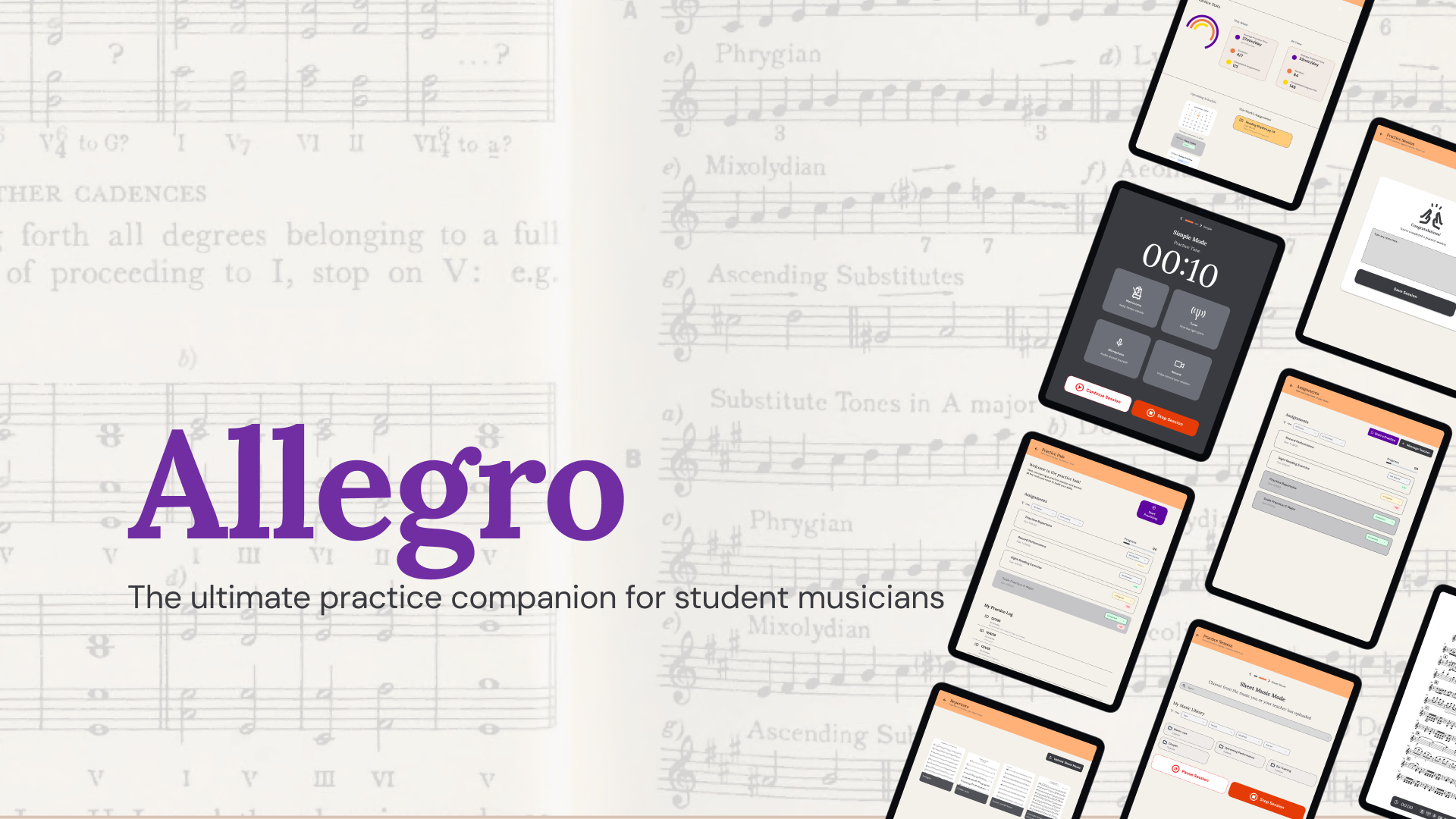
By the time we moved into high-fidelity designs, we weren’t designing from assumptions anymore; we were designing from real user voices. That clarity shaped Allegro into a calm, focused space that brings everything a student needs into one place. A place where students:
- See exactly what they’re expected to practice
- Access their sheet music instantly
- Use practice tools without leaving the page
- Log their progress with just a few taps
- Upload sheet music
- Keep track of their assignments
The experience is intentionally quiet. Nothing competes with the music.

Key Experiences
- Clear Assignments — Weekly assignments are surfaced immediately, removing guesswork and helping students start practicing faster.

- Organized Sheet Music — Sheet music lives in one place, organized by folders, so students spend less time searching and more time playing.

- Tools That Stay Out of the Way — The metronome and tuner live directly within the sheet music experience.
- Progress You Can Feel — Logging a practice session takes one tap. Over time, students can see their consistency grow, reinforcing motivation.

Designing with Intention
Every design decision in Allegro was made to support focus and bring back the magic that music creation is meant to have. To achieve this, we intentionally designed shallow navigation to reduce mental load, clear hierarchies to guide attention, and short, repeatable interactions that feel effortless over time. Accessibility and readability were prioritized over visual noise.
Our product doesn’t try to be loud.
It tries to be reliable.
That mindset shaped more than just the interface — it shaped the identity of the product itself.
Why “Allegro”
Before designing a single screen, we knew the app needed to convey a feeling. We didn’t want practice to feel stressful, repetitive, or like another task to check off a list.
We wanted it to feel alive.
That’s when we landed on the name Allegro. In Italian, allegro means lively, cheerful, and bright. In music, it marks the moment when a piece suddenly picks up energy — when it moves forward with confidence and momentum. It’s the spark that makes you want to keep playing.
That feeling became our north star.
Setting the Mood
Once we knew the feeling we wanted to capture, we translated it into a moodboard. The moodboard is rooted in warmth, golden wood, soft lighting, and textures that resemble a real music room you’d want to walk into. It reflects comfort, familiarity, and intention.
Layered into that warmth is craftsmanship: close-up details of strings, brass, and pianos, reminders that music is something you build with your hands, patience, and repetition.
Finally, there’s energy. Bold oranges, expressive instruments, and moments of creative focus bring in that in-the-zone feeling. Classroom scenes and sheet music ground the experience in learning and growth.
Together, these images define Allegro’s tone: warm, intentional, inspiring, and full of forward momentum.
From Feeling to Form
The next challenge was translating that emotion into a usable interface.
- How do you design something that feels lively but stays organized?
- How do you introduce brightness without sacrificing focus?
- How do color, typography, and spacing work together to support flow?
That’s where the style guide came in. The style guide became the visual rhythm of Allegro — the system that keeps the experience consistent, expressive, and easy to use across screens. It ensured that every design choice reinforced the same feeling we started with: clarity, momentum, and joy.
More Than a Name
Allegro isn’t just a label. It’s the mood, the tempo, the spirit of the entire experience. It’s exactly what we wanted the app to do:
- Make practice feel upbeat
- Help students move with rhythm and intention
- Bring a sense of flow and joy back into learning music
What This Design Achieves: My Takeaways
This project reinforced an important lesson for me as a designer: good UX isn’t always about adding more — it’s often about removing what doesn’t belong. Allegro is a reminder that focus is fragile, and thoughtful design can help protect it.
While conceptual, Allegro demonstrates how UX can directly shape learning behaviors, not by motivating users louder, but by getting out of their way. By reducing friction and not being scared of whitespace, the design:
- Helps students practice longer and more consistently
- Makes progress feel visible and rewarding
- Respects the mental effort required to learn music
Special thank you to my amazing partners, Beth Callen and Karla Santamaria. This project could not have been made without you guys, and huge shoutout as well to our guide, Anthony Conta, for all the support throughout the semester and all the valuable feedback to get this project done :)
Proven Results Across Real Applications
See other amazing case studies