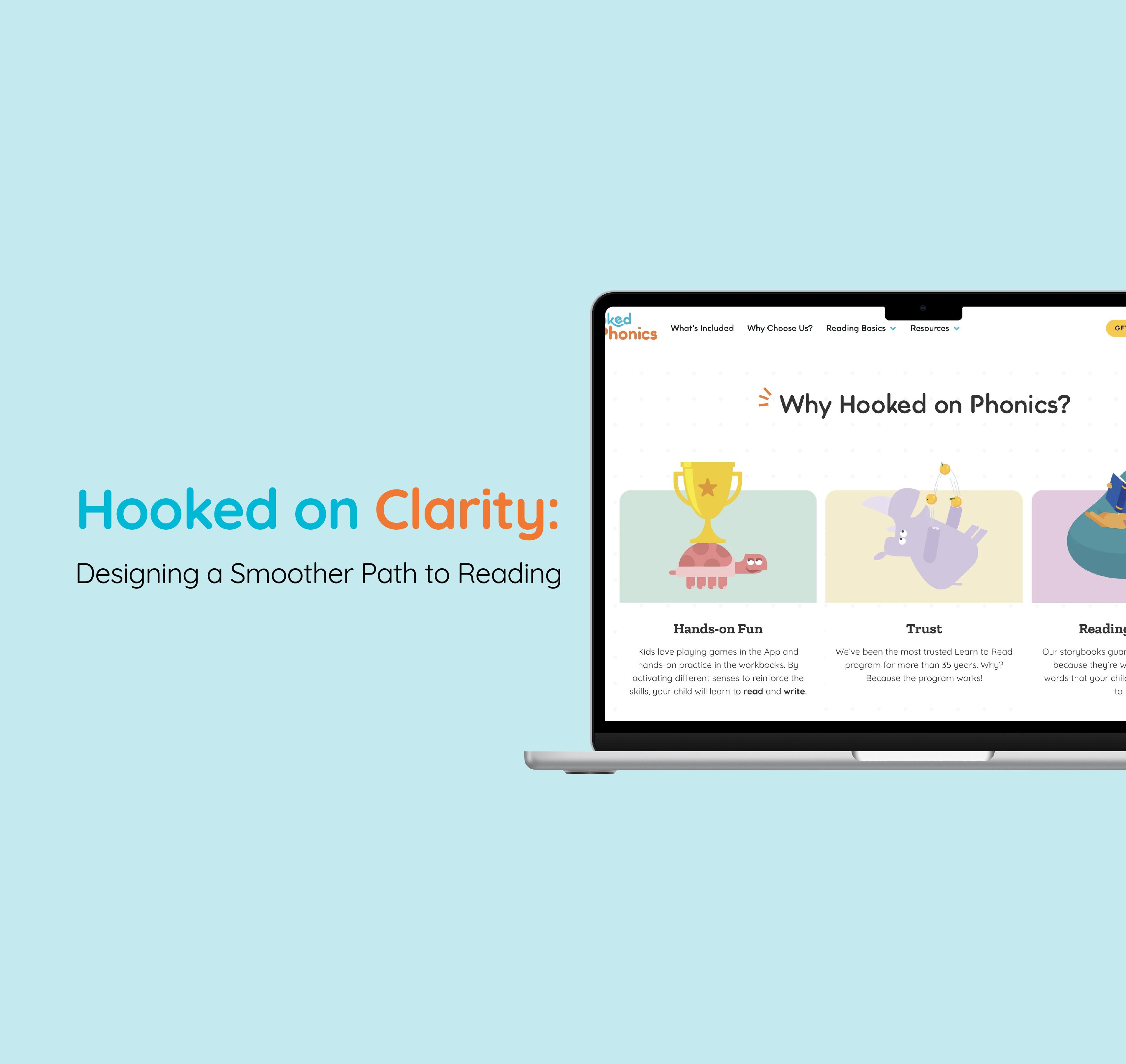
Hooked on Clarity: Designing a Smoother Path to Reading
A Pratt Institute x Center for Digital Experiences usability study redesigning the Hooked on Phonics checkout flow.

Pratt Institute x Center for Digital Experiences
Written by Nallely Martinez Almonte
Click here for the full usability report
Abstract
This case study explores an evaluation of the Hooked on Phonics website, conducted to identify barriers parents face when subscribing to a reading program for their children. Through remote usability tests, we uncovered key issues such as content overload, unclear language, and confusion when conducting a purchase. Four core designs were proposed based on insights from parent feedback to improve the user experience. By creating a more intuitive and reassuring interface, this project aims to help more families access an essential tool in the journey to becoming confident readers.

Where it all started
Every parent wants to see their child thrive, and for many, the journey begins as soon as they begin to speak, and fast forward to when they learn how to read. Hooked has been helping families for more than 35 years, and they’ve helped over 5 million children take their first steps into the world of literacy. As a team of graduate students at Pratt Institute, we investigated how parents navigate through the process of subscribing to a platform that sells a product that helps children learn how to read.
Our focus? The website’s checkout experience and why so many users drop off before completing it. To do this, we expanded the observation and broadened the search to the landing page as well.
Working alongside my teammates Matthew and Sara, qualitative usability research was conducted to find out the cause.
The problem
Our research began with a simple but important question: “What’s getting in the way of parents subscribing to a service that could help their child learn to read?”
To answer that, we looked at more than just the checkout screen. We explored the entire user journey, starting from the landing page.
Methodology
To begin our search, my team and I carried out six remote usability tests in total with parents who volunteered and were recruited through a screener that stated them eligible to participate in this user test. We used the “think-aloud” method, where we asked participants to think aloud and not to hesitate to express how they felt through facial expressions, and/or comments, as they navigate the site. These actions helped us understand not only what users were doing but why they were feeling uncertain.
We designed tasks that could help us understand how parents reacted when they were interested in a product, for their child, and how they navigated the journey of understanding a product they’ve never seen before. It mimicked a real parent’s journey — from learning about the service to making a purchase.
Our tasks reflected a standardized journey that helped us get insights on the following:
- Learning about the program’s benefits
- Understanding what the subscription includes
- Reading customer reviews
- Completing a subscription via the checkout flow
The Tools
- We began by recruiting participants using PanelFox
- Collected consent through Google Forms
- Analyzed our findings with Google Docs
- Created mockups & presentation with Figma
- Showcased this case study in Medium
Understanding Parents
Throughout testing, I kept returning to one thought: parents need simple, straightforward information to gain trust, and not waste time going around. They also enjoy visuals to build that trust, and feel some sort of reassurance to gain confidence as they’re purchasing this subscription.
Some of the key insights that shaped our recommendations:
- Users found the website “too busy” and hard to skim.
- Several participants weren’t sure what exactly they were paying for until late in the process.
- The upsell pages felt repetitive and confusing.
- CTAs like “Try It & Get 94% OFF” triggered skepticism.
Despite this, the majority of participants completed their tasks, and most rated them as easy. But usability isn’t just about task completion — it’s about how users feel during and after the experience.
The Solutions
1. To make the website less busy: Combine Upselling Pages
The current checkout process includes two separate upsell pages, each with a different layout and set of offers. Users found this confusing and disruptive.
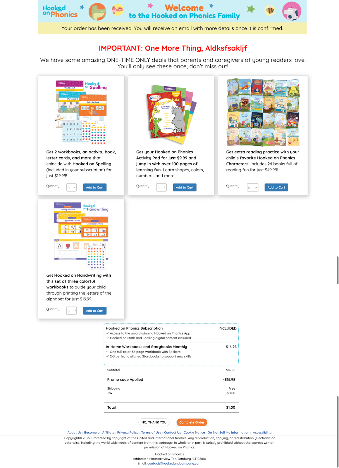
Imagine a busy parent who has already decided, quickly trying to subscribe before their child wakes up again, but they’re forced to take extra steps when they finally believe they are done. Extra steps result in friction, which results in high abandonment rates.

During the testing, some stated the following:
“I would assume that [the process] is done, and I would just close the page if I didn’t want any of these books.”
“If I wasn’t interested in any extras, I probably would’ve closed the webpage and never gotten here [Confirmation Page].”
“If I’m signing up for the first time, I don’t know if I would assume that there would be two more upsells if I was already told that the order was confirmed.”
✅ We merged the two upsell offers into one clean, unified page. Each product offer was clearly labeled as a subscription or a one-time purchase. The redesign reduced friction and respected the user’s time.
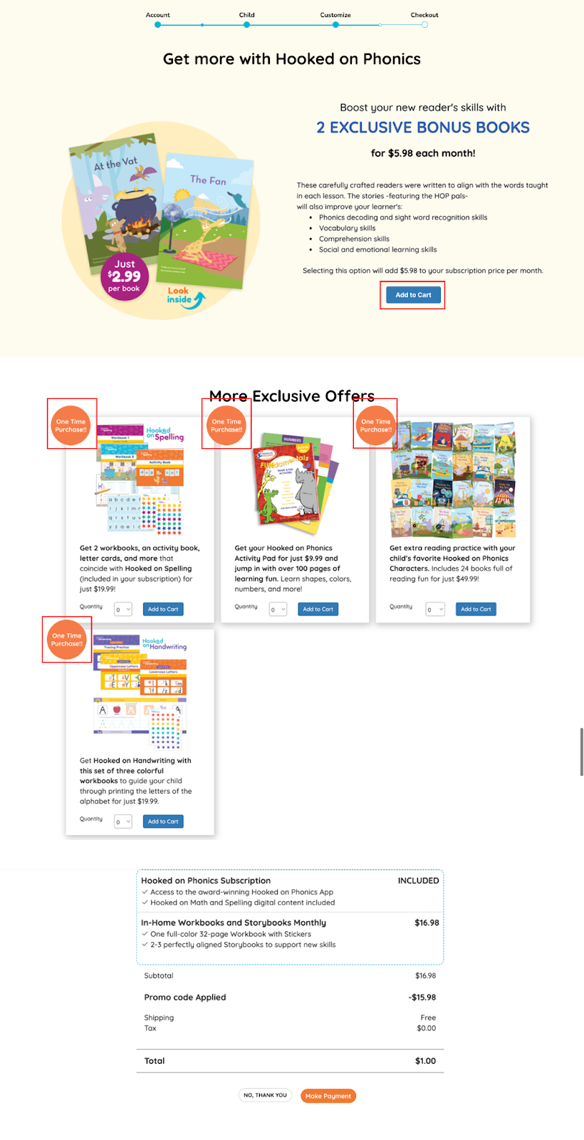
On the same note, several participants thought the checkout was over when they hit the first upsell screen, and some admitted they would have just closed the tab.
2. Optimize the checkout flow: Move the Upselling Step Earlier
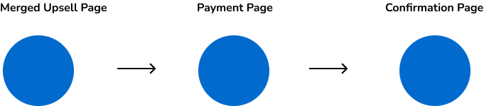
✅ We moved the upsell to appear before the payment page. By doing so, upsell offers come during the shopping mindset, not after the commitment. This small shift aligns with what e-commerce usually does, so implementing it on this website improves conversion potential.
3. Reduce Information Overload
With long text sections and dense graphics, many users stopped reading after the top third of the page.
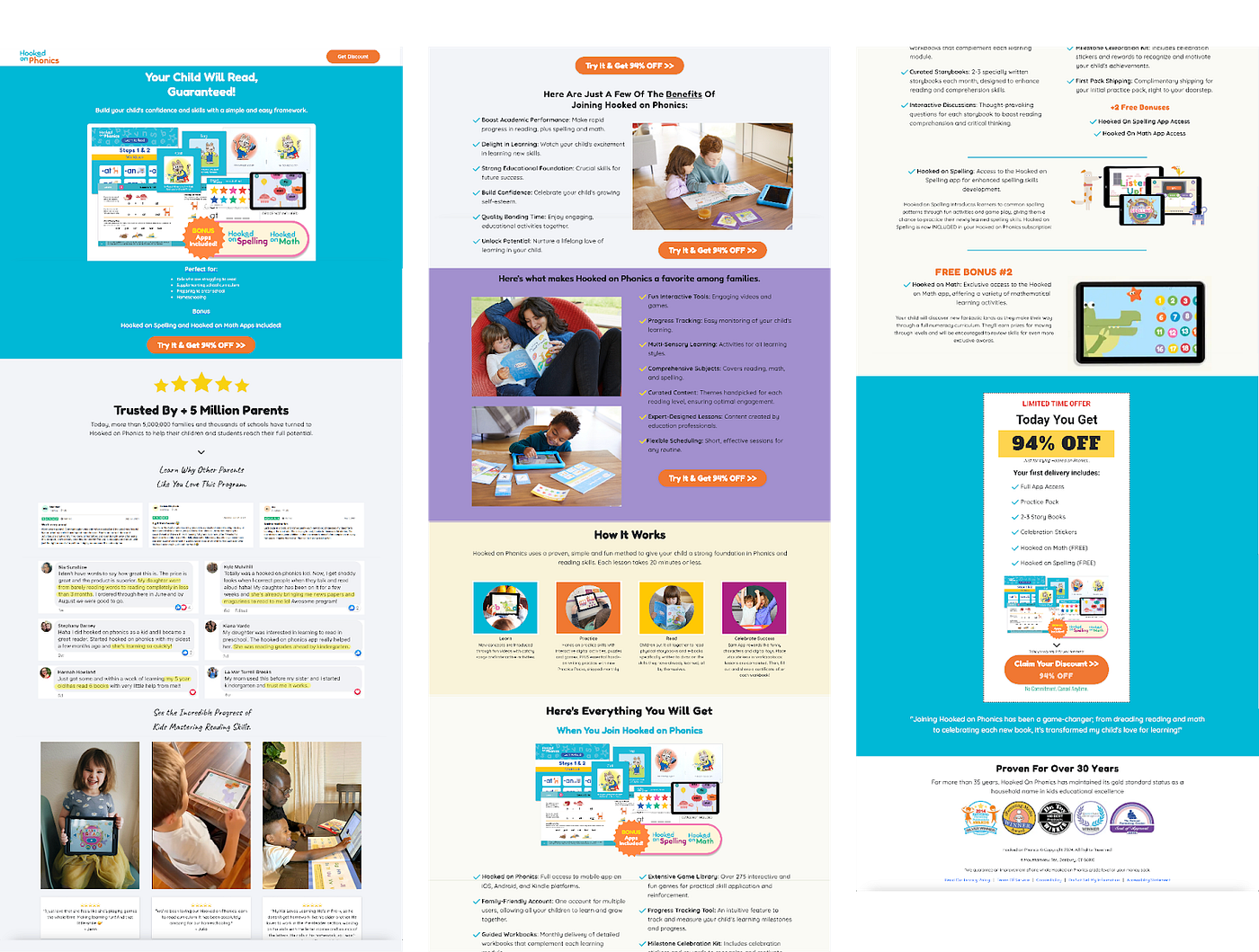
✅ To fix this, we restructured the layout so parents could immediately see what the program includes. We moved reviews further down, imitating popular ecommerce patterns, and removed redundant content. The result: a calmer, less cluttered page.
4. Clarify the Subscription Contents
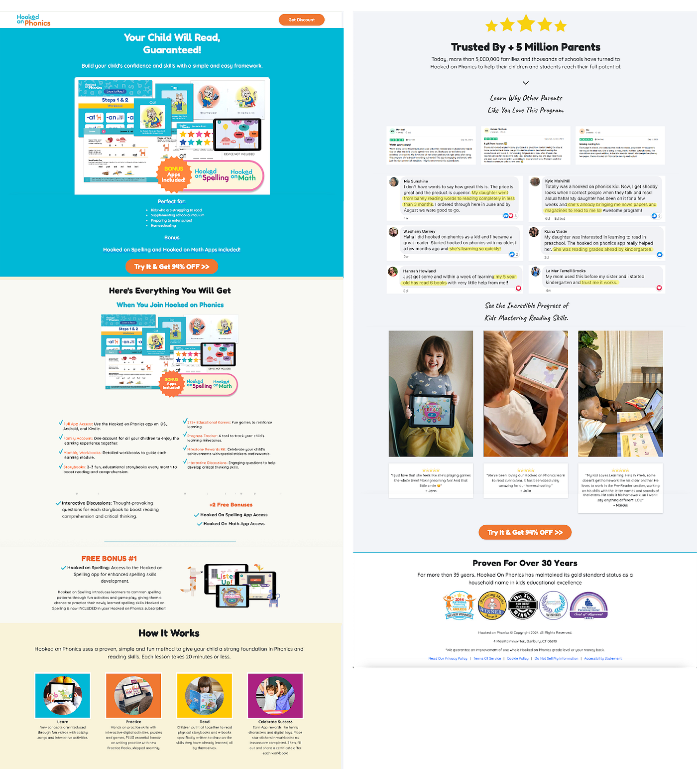
Several parents weren’t sure what they were buying. The “What You Get” section was overcrowded with text, which made it very easy for users in a hurry to overlook this part completely.
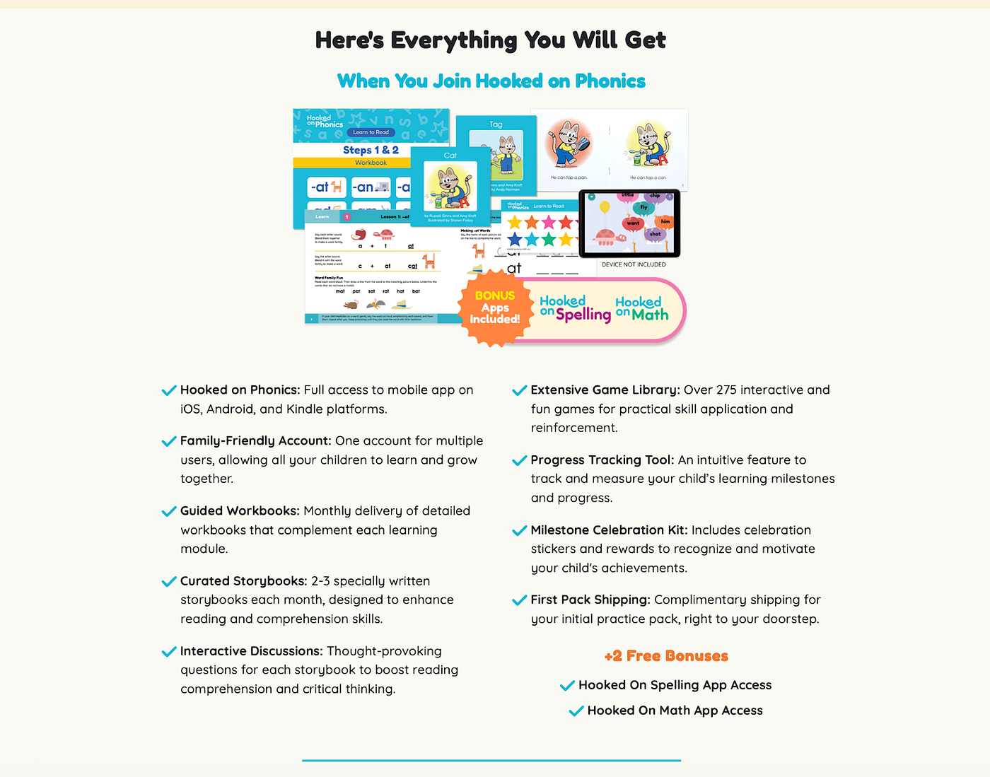
✅ Solution: A redesigned section with shorter bullet points, which gives you a straightforward approach with clear language and shorter sentences.
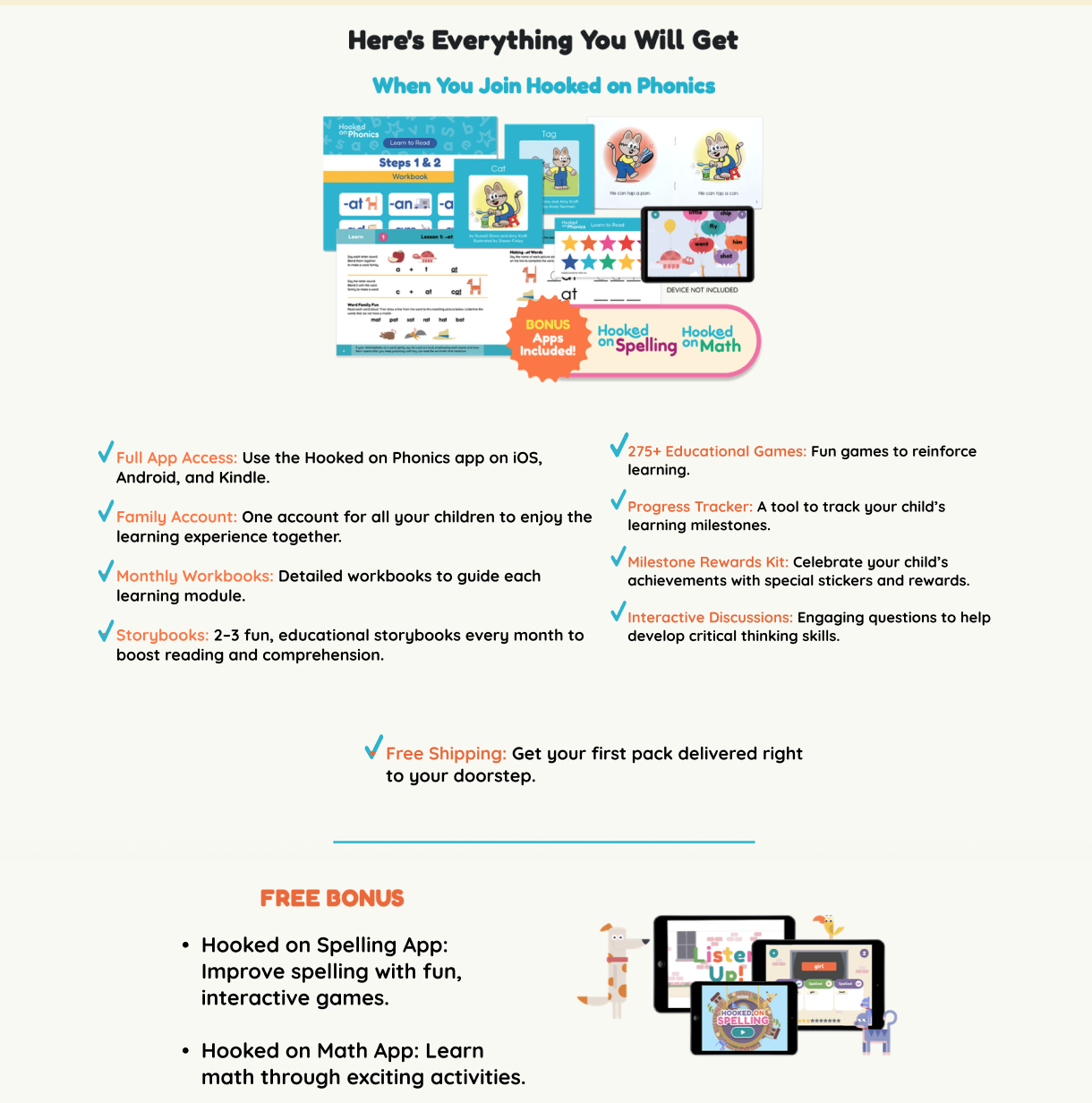
We also redesigned the checkout sidebar and made it much more welcoming and noticeable, so users don’t overlook this important checkout step.
✅ By implementing this redesign, we helped users feel more secure before entering payment information.
5. Build trust: Rename CTA Buttons
“Get 94% Off” sounded suspicious to many participants. It reminded them of online ads, not trusted educational tools.
✅ Solution: We replaced it with one word: “Subscribe.” Honest, clear, and actionable. The new Call to Action button aligned with user expectations and helped build trust in the product.
In the end…
This project wasn’t just about cleaning up a website — it’s about carefully curating and observing an important experience that shapes a young child’s future in the literacy world. Behind every test session, every frustrated comment, and every scroll, was a parent trying to make the right decision for their child.
Our job as designers wasn’t just to remove friction from a digital journey — it was to protect the magic of the moment when a child enters the beautiful journey of reading. By redesigning the user flow, we are able to establish confidence, not confusion; hopefulness, not stress. By doing so, we give clarity to the overwhelm.
This project reminds me why we design in the first place: it’s a promise we make as designers, to make the world a better place by making things accessible and user-friendly to all, to break barriers and improve experiences. In this case, to the parents out there, that the tools meant to help their child won’t stand in the way of making the first step toward making reading a little easier. Because sometimes, learning to read starts with good design.
Proven Results Across Real Applications
See other amazing case studies