Money Mirror: Designing Without Judgment
Money Mirror is a reflective fintech journaling app designed to help users understand the emotional patterns behind their spending. Built as a team of three for my Emotional Design course at Pratt Institute. I led the research that shaped the entire product: the problem framing, the statistics, the affective personas, and the emotional journey map that every design decision traced back to


This is not a budgeting app. It is a mirror.
The Problem
Most people don’t overspend because they’re irresponsible. They overspend because they’re human. A stressful afternoon at work, a friend’s vacation on Instagram, a slow Sunday — any of these can quietly trigger a purchase that has nothing to do with actual need. And afterward, the guilt doesn’t make people more financially aware. It makes them avoid their bank account altogether.
That avoidance was the design problem I wanted to understand. Because shame, as Brené Brown’s research makes clear, corrodes the very part of us that believes we’re capable of change. Every existing fintech tool that greets a user with a red number or an over-budget alert is introducing shame at precisely the moment a person is least available to receive it.
When I started conducting interviews, something kept coming up. People knew they had a problem with their finances. They already had apps. They were already seeing the data. And yet nothing was changing.
And the reason, once I heard it enough times, became really clear:
the apps they had were only showing them numbers.
And when you have bad spending habits and an app just keeps exposing that to you, every purchase logged, every overspent category highlighted, it doesn’t help you do better. It just makes you feel worse.
I wanted to design something that worked differently.
The Research
Before we touched a single screen, I spent time building the research foundation that would hold the whole project together.
Financial anxiety in America is not a niche problem.
A2024 Discover Personal Loans survey found that 80% of Americans report anxiety about their financial situation — a number that has remained stubbornly high for three consecutive years. Among Gen Z specifically, 62% report feeling financially stressed more than three days a week. More than half of Americans say money has negatively impacted their mental health. And the most common response to that anxiety is avoidance — not opening the app, not looking at the balance, not talking about it.
Social media compounds this. Nearly half of all social media users have impulsively purchased something they first saw in their feed, and 68% of those buyers regret at least one of those purchases. Over a single year, U.S. adults spent $71 billion on impulse purchases driven by what they saw online. The scroll becomes a trigger. The purchase becomes a response to a feeling that was never really about the product.
But the research also pointed toward something hopeful. Studies on affect labeling — the act of putting a feeling into words — show that naming an emotion reduces activity in the brain’s threat detection system and increases engagement in the prefrontal cortex, the region responsible for considered decision-making. Naming what you feel before you spend literally changes which part of your brain is driving. Reflection isn’t just emotionally useful. It’s neurologically measurable.
That mechanism became the foundation of Money Mirror.
The Personas
Standard user personas tell you what someone does. Affective personas tell you what someone feels — and why that matters for design.
I built four personas mapped across two axes that most fintech ignores entirely: financial literacy and financial means. The purpose of broadening the scope with four personas rather than normally one, was to map the full emotional scope of the problem.
- Alexis, 24 — low literacy, low means. Shame arrives fast and she has neither the vocabulary nor the financial margin to buffer it. She has never used a budgeting app because the setup screens alone made her feel unqualified. For Alexis, the app needs to signal belonging before it asks for anything.
- Marisol, 28 — high literacy, low means. First-gen American, financially competent, completely exhausted by her own competence. Her emotional spending pattern isn’t excess — it’s deprivation. She under-spends on herself in ways that accumulate into quiet resentment. For Marisol, the app needs to hold sacrifice as a valid entry, not just purchases.
- James, 31 — high literacy, comfortable means. He knows the numbers. He has a spreadsheet. He still overspends emotionally and has no framework for why. His avoidance is affordable, which is exactly what makes it invisible. For James, the app needs depth without cheerleading.
- Donna, 47 — low literacy, comfortable means. A caregiver who spends freely on everyone else and second-guesses every purchase she makes for herself. Her most emotionally significant moments often aren’t transactions at all — they’re invisible labor absorbed without acknowledgment. For Donna, the app needs to hold care work as something worth logging.

What struck me building these personas was how differently shame operates across all four of them. It arrives fast for Alexis, quietly for Marisol, invisibly for James, and sideways for Donna. Any tool designed to address only one version of that experience would exclude the other three.
The Emotional Journey Map
To translate the research into something the design team could actually build from, I developed an emotional journey map anchored in Alexis’s week — a scenario I called “The Wednesday Purchase.”

It’s a Wednesday. Alexis had a hard week at work. On the subway home she opens Instagram, sees a friend’s trip she wasn’t invited to, and by the time she gets to her stop she’s bought a $68 skincare set she didn’t plan to. She told herself she’d been good lately.
The map traces five phases: the payday high, the comparison trigger, the impulse buy, the numbness when she sees the charge two days later, and the avoidance that follows until she mentally resets for the next payday
At each phase, I identified what she was actually feeling, what she was available to receive, and what an app touchpoint at that moment needed to do
Or more importantly, not do.
The clearest finding was Phase 4.
When Alexis closes her banking app after seeing the charge, most fintech tools apply maximum pressure: alerts, notifications, over-budget warnings. But that’s exactly the moment she’s least available to receive them.
- She knows. She doesn’t need to be told. What she needs is a soft surface: something that says “you logged something earlier this week, no pressure — just here if you want to add anything.”
That one insight is the core that makes us stand different from the rest of other finance apps out there, we cater to that emotiona aspect of finance by checking in with the user, as well as showing them their data. When we knew and understood the power of our core, we proceeded to design.
The Prototype
Armed with the research and the personas, the team built a two-iteration mobile prototype. My research directly informed every core design decision:
- No red in the interface. Color carries emotional weight before a word is read, and red signals failure. We used warm parchment, soft lavender, and sage instead.

Emoji as a primary entry point, not a fallback. For Alexis and Donna, an emoji is a complete and valid response. Treating it as less than that would have excluded the users who needed the tool most.
Essential vs. emotional spending separated by design. Rent and a stress purchase are not the same thing. Mixing them in the same reflective picture produces confusion instead of insight — especially for Marisol, whose essential spending and emotional experience are structurally entangled.
No scores, no grades, no failure states. Patterns are surfaced as observations. The app asks “did it help?” rather than “was this in budget?” — a small reframe that changes the entire purpose of the interaction.

User Testing
We tested the first prototype with four participants across different financial backgrounds. The results were more direct than I expected.
Every single participant felt no judgment from the app. The non-judgmental tone landed consistently across very different user types.
- One participant described the experience as feeling like being hugged and told it was okay — repeatedly.
- Another moved, visibly and in real time, from shame to grace.
- They said that just by speaking openly about their spending, they had encouraged themselves.
- That is affect labeling working exactly the way the research said it would.
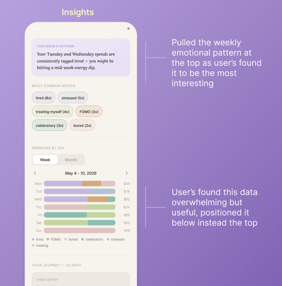
The main area of friction was the Insights screen, which participants found dense. The data was useful, but arriving all at the same time, made it seem overwhelming for some users, and didn’t make it seem like a reflective space, like we were trying to portray from the beginning.
During our second iteration, we made sure to take that feedback and make it one of our primary changes in the second iteration: moving the weekly emotional pattern summary to the top and pushing the data-heavy chart lower.


Key Insights
The biggest thing this project confirmed is that the gap between knowing and changing is almost never filled by more information. It’s filled by feeling understood.
Every research decision I made with my team, taught me that the research in emotional design isn’t just about understanding users. It’s about creating the conditions for the right design questions to get asked.
Money Mirror still has room to grow. Marisol’s experience — where deprivation, not excess, is the emotional event — deserves a more developed logging structure than the current prototype offers. And the question of how the app scales to users with no journaling habit at all remains open. But what the project proved is that a financial tool can earn trust not by tracking better, but by judging less.
And that starts with research that takes emotion seriously before a single screen is designed.
Special thank you to my team Apoorva Kavitkar, & Kirah Tabourn
Proven Results Across Real Applications
See other amazing case studies