Mount Sinai Check-In Kiosk: Reducing triage bottlenecks through conversational automation
How might we automate repetitive intake tasks so hospital staff can shift focus from administrative data collection to immediate clinical assessment and patient care?


Project Overview
The Mount Sinai Triage & Pre-Visit Intake Bot is a kiosk-based conversational system designed to streamline patient intake the moment they walk into the hospital.
- My Role: Conversational UX Designer
- Team Size: Solo project
- Project Type: Conversational UX, creation of a chatbot
- Platform used: Voiceflow
- Timeline: 2 months
Problem & Opportunity
Hospital staff all over handle repetitive tasks: symptom collection, identity verification, insurance checks, and routing. Doing so often requires a good amount of personnel, and it only gets more tricky when patient intake increases.
This leads to:
- Long triage wait times: Patients often wait 45–90 minutes before initial clinical triage, causing high stress and dissatisfaction.
- Delayed identification of high-severity patients: Difficulty in quickly identifying true high-severity (Red Flag) patients, which poses a safety risk both for patients and hospital staff.
- Repetitive administrative burden: Nurses spend too much valuable time on data entry rather than patient care.

The Opportunity
How might we automate repetitive intake tasks so that hospital staff can shift their focus from administrative data collection to immediate clinical assessment and patient care?
A conversational kiosk bot can cut this time significantly by having the patient triage themselves based on short form questions about their symptoms, and once done, nurses can benefit from the time saved to take better care of the patients, since they already have a good summary of what the patient is coming to the clinic for.
This self-service kiosk design addresses hospital triage bottlenecks by providing a sleek, intuitive digital front door that separates administrative check-in from clinical assessment. The interface uses clear, high-contrast buttons and prominent branding to build user trust and guide patients quickly through their registration journey. Strategically placed in the lobby, the kiosk aims to improve efficiency by reducing queues and allowing staff to focus immediately on patients requiring clinical attention.
Design Choice: Kiosk
A stationary kiosk ensures data privacy and physical presence upon arrival. It guarantees that patients complete the check-in before seeing a nurse, and it’s available already on hospital ground, instead of other options like a mobile device, where the patient is required to own one to receive a service.
Kiosk’s Purpose
What does it do, in a nutshell?
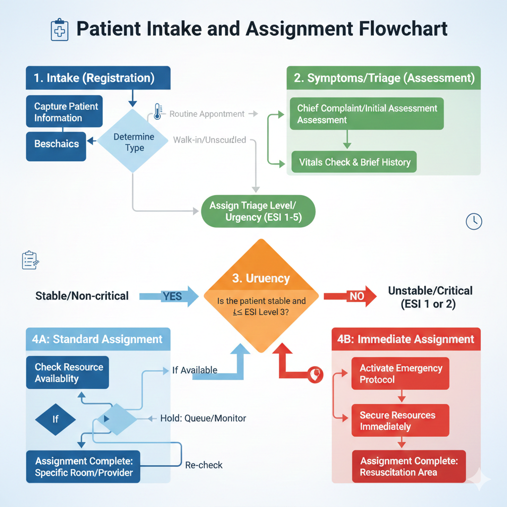
- Check-In & Intake — First step is to collect your personal data, insurance, pronouns, accessibility needs.
- Symptom Collection — Guided questions, red-flag detection, no diagnosing.
- Urgency Assessment — Classifies low, moderate, or high urgency.
- Department Assignment — Routes patients immediately to the right place.
Constraints
Key Constraint: The bot cannot provide a diagnosis or medical advice. It must use medically safe, yet accessible, language.
User Needs
Patients want fast, accessible, and supportive check-in so that they can get help fast and effectively as soon as they walk through Mount Sinai doors.
Staff want accurate information upfront, so that they can treat patients correctly, and save time asking them “how do you feel?” over and over.
Bot Personality
Interaction Goals
The bot’s personality supports three core goals: helping patients feel calm during check-in, collecting accurate information quickly, and guiding them through the triage flow without confusion. Every aspect of the personality is shaped around reducing stress and creating clarity.
Level of Personification
The bot uses medium personification — human enough to feel reassuring and supportive, but not so conversational that it feels inappropriate in a clinical setting. It avoids humor or small talk and sticks to functional empathy.
Power Dynamics
The bot holds informational authority because it guides the patient and controls the flow of questions, but the patient keeps personal autonomy. The relationship is not intimate; it is brief, procedural, and focused on safety. As the interaction progresses, the bot becomes more directive only when needed (e.g., identifying urgent symptoms).
Character Traits
- Calm — it never mirrors patient stress.
- Supportive — acknowledges concerns without diagnosing.
- Clear — uses straightforward, accessible language.
- Patient-Centered — adapts to needs like accessibility or pronouns.
Tone
On the tone spectrum, the bot is:
- Formal → Casual: Slightly formal
- Expert → Novice: Knowledgeable but non-technical
Key Behaviors
In stressful moments (e.g., reporting chest pain), the bot slows down, reassures the patient, and provides clear next steps. When it cannot answer something it redirects with safe, supportive language such as: “I can’t determine that, but I can help get you to the right care team quickly.”
Conversation Flow

- Welcome — The chatbot greets the user and allows them to select their preferred language. By doing so, it becomes accessible to many users.
- Type of visit — After the user selects their visit between appointment or walk-in, the kiosk would request more information regarding the visit, such as pronouns and accessibility needs (e.g., if Deaf/HOH, an interpreter will be called).
- Symptoms — This state divides into two sections. The user can choose what symptom is bringing them into the clinic via buttons, then is prompted to explain a bit more about their symptoms.
- Severity — The chatbot asks two more questions to be able to properly triage the patient: the duration of these symptoms, and a pain scale from 1–10.
- Department — With 1–5 severities, the chatbot uses this information to recognize the kind of doctor needed for the symptoms presented. 7–10 severities get priority in triage, due to the severity of the illness. This process is told to the user.
- Confirmation — Before sending the information to the hospital staff and triage, the bot confirms once more all this information for the user to read, and know what to do next.
- Triage — Bot instructs user where to go after triage.
- End — Chat ends.
Wizard of Oz Testing Summary
I conducted a Wizard-of-Oz test by sharing the prototype with 3 different users; their only instructions were to check into a hospital for any sickness they could think of.
Key Observations:
- They found the kiosk was asking too much information
- They wanted larger, clearer symptom categories
- They appreciated that pronouns and accessibility options appeared early
- They moved too quickly through symptom severity questions
- Didn’t know what to do after chat ended
Design Changes After Testing:
- Shortened severity questions
- Added quick-tap symptom categories instead of all text
- Clarified next steps after triage
Running this test helped me see how users actually respond to chatbot prompts, where confusion happens, and what needs to be simplified. The biggest challenge was making the bot feel natural while keeping the flow efficient. My key takeaway is that conversational design improves fastest when you test early and let real user behavior inform every decision.
Conclusion and Key Takeaways
Key Learnings
- Efficiency through Conversation: The biggest design lesson was that conversational interfaces, when structured correctly, can gather complex data (like symptoms) faster and more efficiently than a long, daunting web form.
- The Necessity of Guardrails: For high-stakes domains like healthcare, the bot must be built with strict functional empathy — it cannot comfort or diagnose, but it must act clearly and swiftly when safety is compromised.
- Validate Early: The Wizard of Oz test was critical in identifying the need to slow down the interaction during severity checks, proving that user behavior does not always align with designer intent.
The Mount Sinai Check-In Kiosk successfully demonstrates how targeted conversational automation can solve critical bottlenecks in hospital triage. By prioritizing clarity, calm, and structured data collection, the system transforms a high-stress, 45-to-90-minute administrative process into a fast, self-service intake experience. It validates that a well-designed conversational interface is not just about convenience — it is a powerful tool for improving patient care and optimizing clinical service in demanding healthcare environments.
Proven Results Across Real Applications
See other amazing case studies